COVID-19 Percent Deaths as of September 3
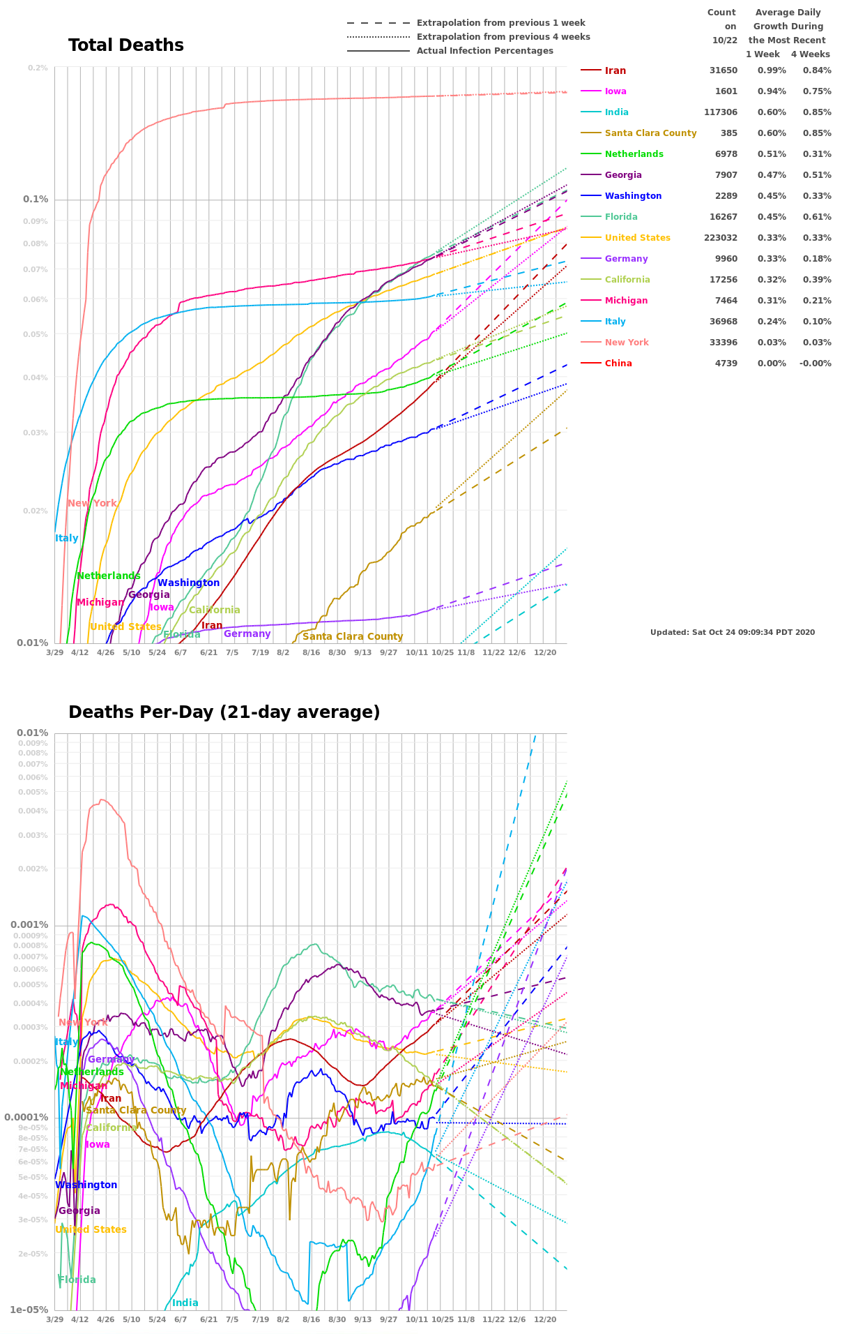
Deaths per day is a lagging indicator that is not influenced by the testing rate. I’m averaging the past 7 days to smooth noise, and to eliminate a pattern of higher values toward the end of the week.
Encouraging Antibody Results from LA
LA Public Health just released early results from their antibody testing suggesting that between 2.8% and 5.6% of the population has been infected. With 619 deaths, this implies a fatality rate between 0.41% and 0.28%.
The influenza death rate is often quoted as 0.1%, but that comes from dividing the number of flu deaths (34 thousand in 2018-2019) by the count “symptomatic illnesses” (35 million in 2018-2019) (reference). The death rate for flu is lower if you include non-symptomatic illnesses to make the results comparable to the antibody analysis.
If we assume the 0.35% fatality rate applies everywhere, we can estimate the percent infected in any region. For example, New York City has 14,604 deaths implying 14,604/0.35% = 4.2 million infections. With 8.4 million inhabitants, this implies 50% of New Yorkers have already been infected. This does not give the virus much room to grow there. I hope we can get an antibody survey in New York to check this.
Santa Clara County has 83 deaths implying 83/0.35% = 24 thousand infections. With 2 million inhabitants, this implies 1.2% have been infected. This is not too far from antibody results released a few days ago that estimated 2-4% of Santa Clarans have been infected.
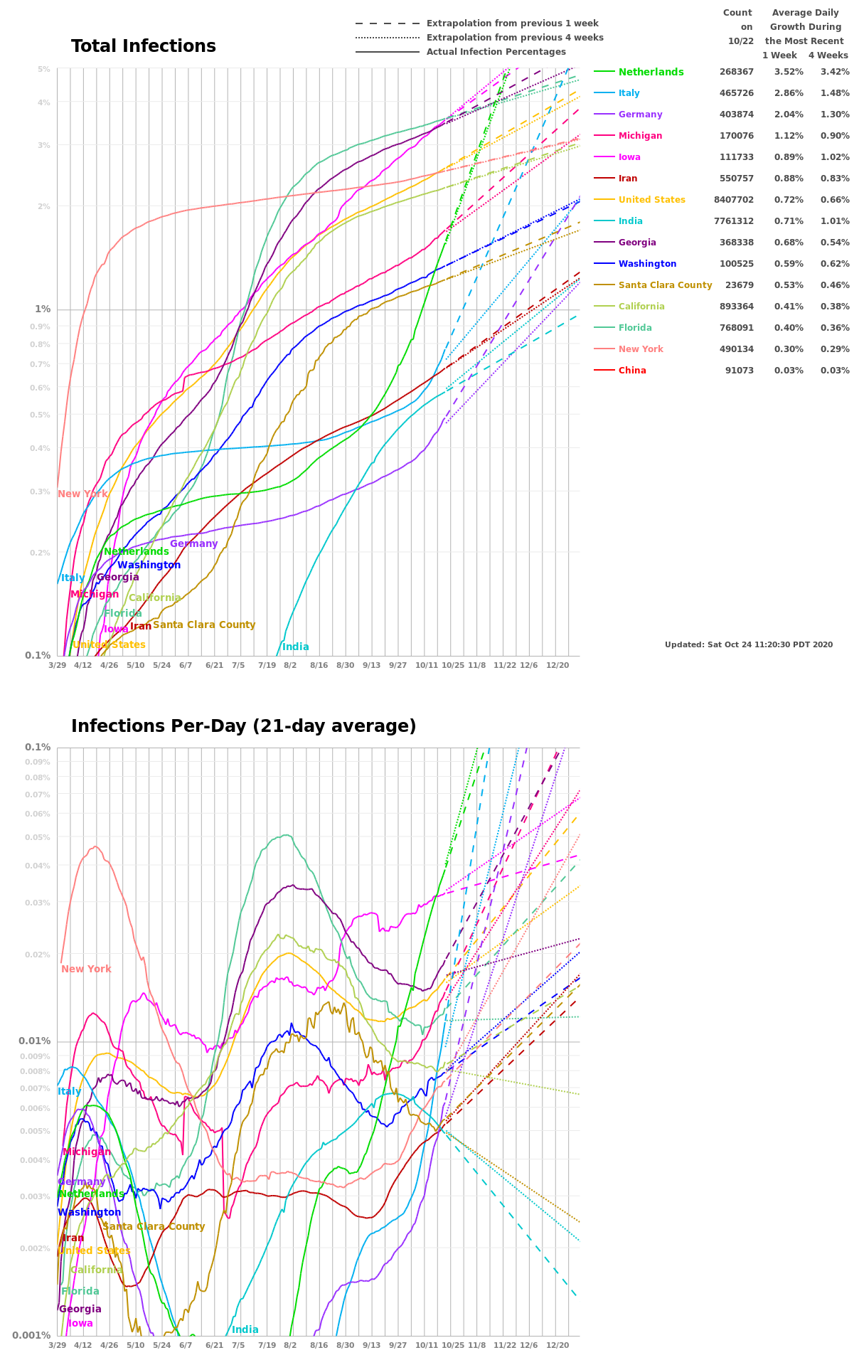
New Infections Per-Day
I added a new plot that shows the percent of the population that is newly infected every day. I take the average of the previous four days to smooth the curves.
The per-day curves show that China’s second peak is starting to recede. Italy is past its first peak. Maybe Germany and the Netherlands and Santa Clara have peaked. Things do not look good for New York.
India is well into exponential growth. It’s not clear if this is because their stay-at-home policy has not had time to work, or if they are ramping up testing. Probably both.
We’re seeing a nice Bend
We’re seeing a consistent and dramatic drop in the average daily growth rate everywhere I’m tracking, except India. The 1-week growth percentage numbers are all smaller than the 2-week numbers. The dashed lines all lie below the dotted lines. This is very good news.
I suspect (hope) that the India increased growth rate is due to increased testing there.
Average Daily Growth
The table of “Average Daily Growth During the Most Recent 1 Week and 2 Weeks” gives the ratio of total confirmed infections on a day divided by the number from the previous day. For example, a 18.92% daily growth rate results in doubling every four days (1.1892 * 1.1892 * 1.1892 * 1.1892 = 2.0).
If I’m Infected, Will I Die?
The chance of dying from the infection depends on the ratio of fatalities to infections. We only know the ratio of fatalities to confirmed infections (around 2%). The number of unconfirmed infections is the big unknown. If many people are infected but have not been tested, then the ratio of fatalities to infections could be significantly lower than 2%. Countries with higher testing rates tend to have lower fatality percentages. I suspect this is because they identify more mild cases that are not tracked in other countries.
As we ramp up testing, the ratio of fatalities to confirmed infections will drop. I hope the ratio drops a lot because that means we all have a better chance of surviving if we become infected.
Understanding Log Plots

Where would you rather be? The Linear Plot suggests Region A is in worse shape. But, the Log Plot shows that Region B is likely to soon become much worse than Region A.
The pandemic’s exponential growth rate is shown as the slope of the curve in the Log Plot. The Log Plot slope of Region A is improving and Region B is getting worse. That tells you Region B is in more trouble.
To help see the change in the slope, I extrapolate a dashed line based on the past seven days and a dotted line based on the past 14 days. Region A shows improving slope because the dashed line lies below the dotted line. Region B shows the reverse and will have everyone infected unless it can bend the curve down like Region A.
You can see this numerically in the number of days to double. Increasing the days-to-double is the same as decreasing the slope of the curve in the Log Plot.
US Infections Go Super-Exponential
The seven-day average number of days-to-double in the United States dropped to 2.03 from 2.36 a few days ago. The days-to-double keeps dropping, making the infection curve super-exponential.
If each infected person sickens one additional person every two days, the total number infected would double every two days, and we’d have exponential growth. Super-exponential growth happens if the time to infect the next person decreases every day.
The difference between the confirmed infection counts and the actual counts could explain the super-exponential growth. As the testing increases, we are doing a better job uncovering the underwater part of the iceberg which is the infected, but uncounted. If so, we should see the super-exponential growth fade to exponential, and then sub-exponential as the testing rate stabilizes, and the containment measures take effect. We would see this in the log-plots as a transition from bending-up to straight-line to bending-down, and the dashed line dropping below the dotted line.
Will I get Sick?

In the United States, the number of infected has been doubling every two days. With 20,000 infections and a population of 327 million, it will take 14 doublings before everyone has it:
20,000*2*2*2*2*2*2*2*2*2*2*2*2*2*2 = 327 million.
At the current rate, this will happen in 14 * 2 = 28 days, and occur around April 19.
To prevent this, we need to increase the time to double the infection count. This is why social distancing and shelter-in-place is important. Are they working?
Look for an increase in the days to double and a flattening of the slope of the infection curve. The slope of the United States infection line has held steady or become a bit steeper in the past two weeks. Compare this to the Iran line (which noticeably flattened since the beginning of March).
Put a ruler on an infection curve so it lines up with the past seven days, and extend the line to the right. Do the same for the past fourteen days. This, essentially, is how I made the dashed and dotted lines.
The dashed and dotted lines are an estimate of what the future brings if we continue at the same rate of growth. The difference between the dashed and dotted lines tells how the growth rate is changing.
For example, the Iran dashed line lies below the Iran dotted line. That suggests that Iran is increasing the number of days to double the infection count (from 7.23 days to 9.68 days). In contrast, the United States doubling time decreased (from 2.39 to 2.14) in the same period.
To predict the course of the pandemic, watch the slopes of the dashed and dotted lines. Look for the dashed lines to go below the dotted lines for each region. Look for the curves to flatten. Compare the progress of regions that have already flattened for an idea of what it might look like when your region starts to flatten.
Excellent New York Times Log Plots for Death Rates We can be more certain of death than infection, so curves based on death are more trustworthy. I’m planning to stick with plotting infection rates because this gives an earlier indication of the trends.